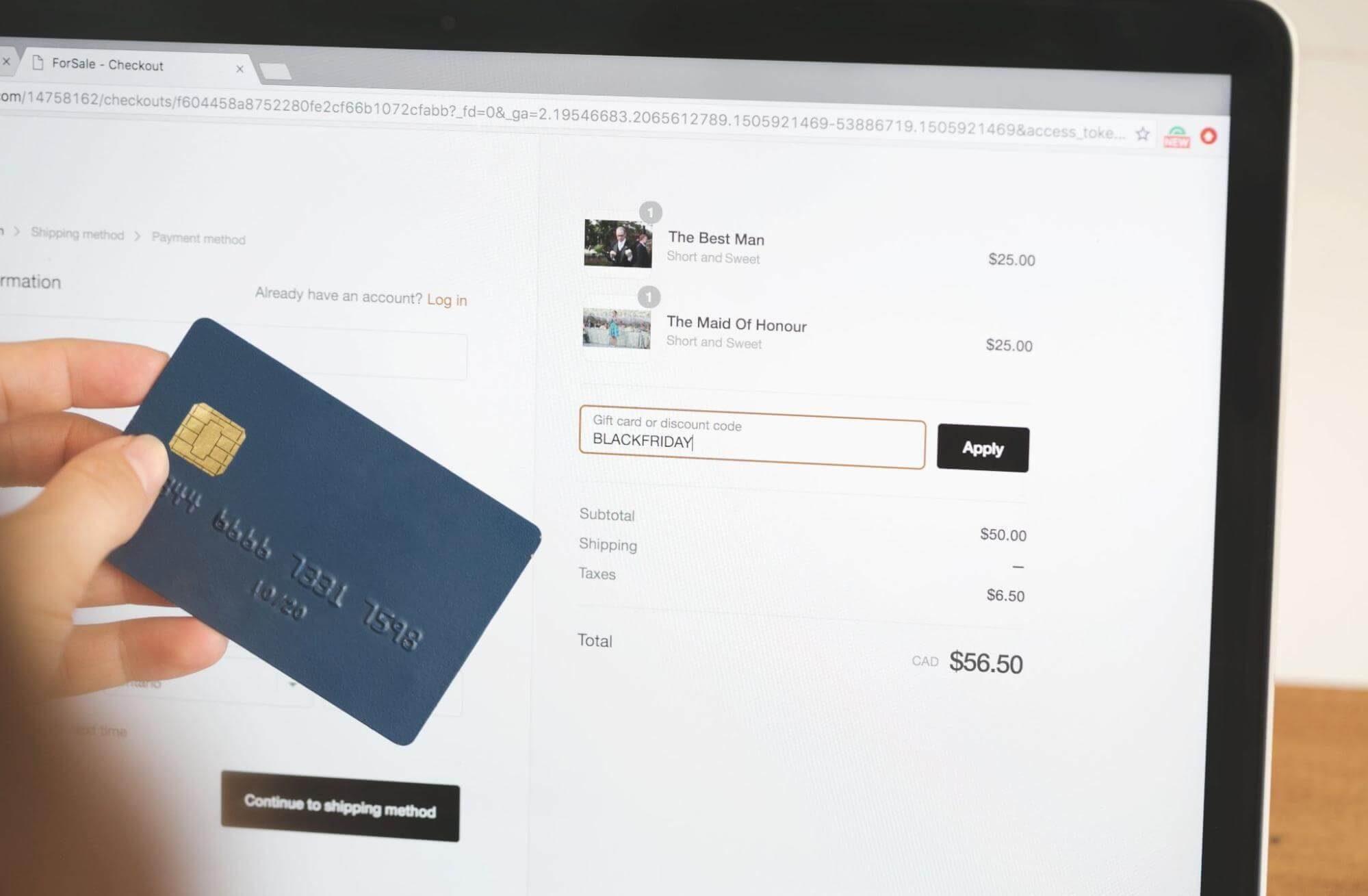
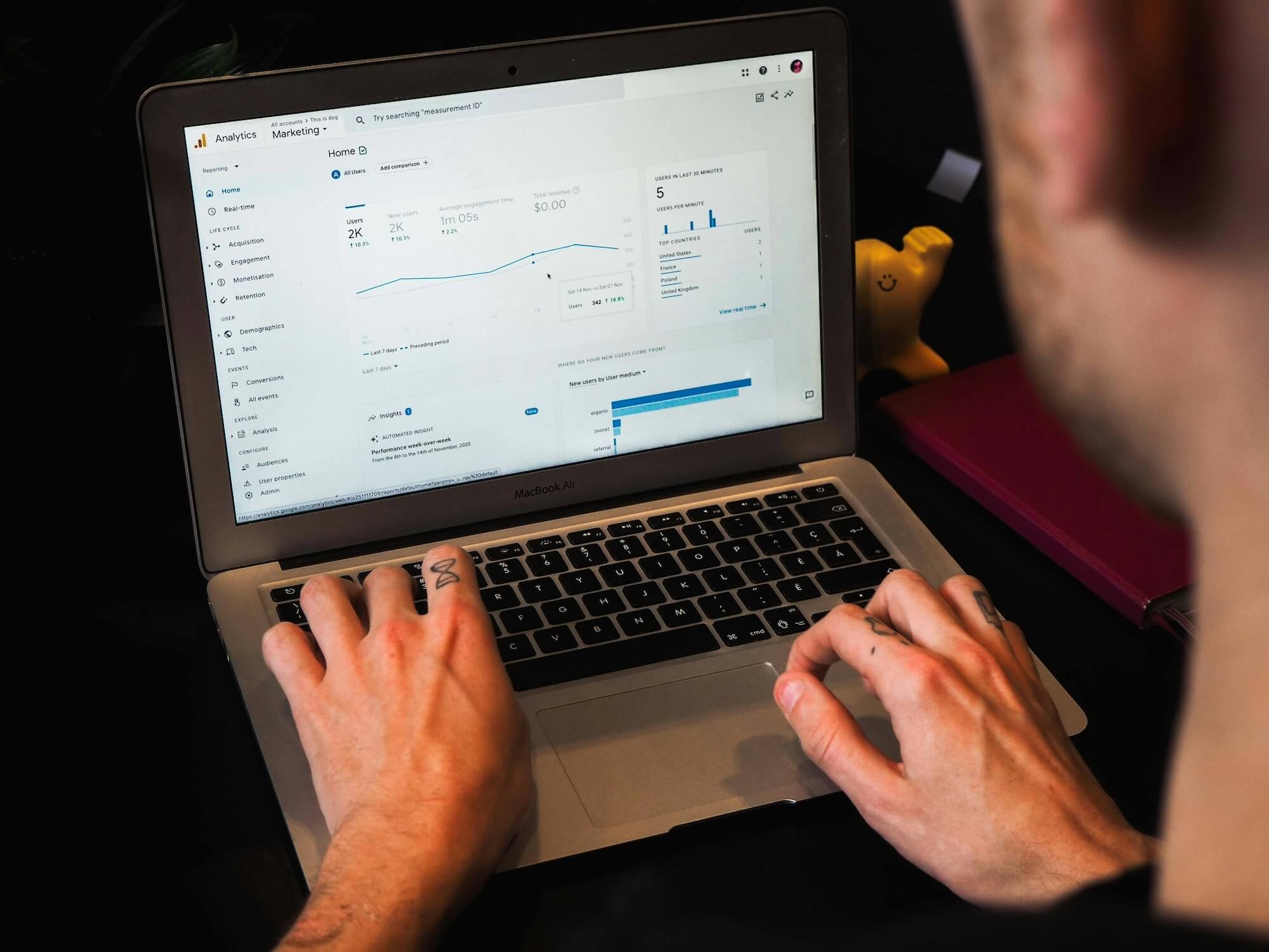
Our top tips for improving UX on a Shopify website

Author: Harry Phillips - UX Analyst

Date: 31 January 2023

What is User Experience?

User experience is the entirety of someone’s interactions with your business and brand, so it is crucial to think about optimisation and UX when creating a Shopify site. This blog will cover some user experience and optimisation tips to help you improve your Shopify site. 

When you’re thinking about the user experience (UX) on your Shopify site  you want to think about how your site is laid out, how easy it is to use, how you engage your customers, what kind of language you’re using. The goal of user experience design is to help people accomplish what they want to do as easily as possible. Essentially, the goal of UX design is to make things simple for customers.

Why is optimising User Experience important?

User experience is one of the top priorities when thinking about a site and its functionality. 87% of people say that a positive experience on a site is what leads them to buy. That means that a bad experience can actually lead to people leaving your site before they even have the chance to buy something and what’s even more startling is that 42% of people say that they’ve left a site because it was difficult to navigate or it didn’t load properly. That’s why UX is so important, as it helps you keep your customers engaged and encourages them to take action.

How to optimise User Experience in Shopify?

When it comes to optimising User Experience in Shopify, there are a few areas that you should focus on. They include improving your store’s navigation, improving your product pages, and improving your checkout process. All of these areas are important when it comes to optimising user experience as it allows the user to navigate fluently and make the process of their intended need, such as making a purchase, as smooth and as simple as possible. If one of these pages doesn't function well, your customers are going to notice and may leave the site.

What does optimised UX look like?

A website that is optimised with user experience in mind will guide your customers through all the steps they need to take to achieve their intended needs such as buying a product. It will be easy for customers to navigate your site, and they will be able to find what they’re looking for without struggling.

When it comes to product pages, you want to make sure that your product information is detailed and descriptive. This will help to answer any questions that your customers might have about the product and make it easier for them to decide if it’s the right product for them. However, you don’t want your product descriptions to be too obvious or forceful. 

To optimise your website so it is efficient for your customers follow these three easy steps:

Step 1: Improving your Store’s Navigation

Your navigation should be designed so that it makes it easy for web users to move fluently through your site. It functions like a map, with the goal of making it simple for customers to locate what they are searching for, such as a particular product, the returns policy, or a collection page. 

The first thing you want to focus on when optimising for user experience is improving the navigation. If it is too cluttered and difficult to use then the quality of your products are of no concern as it’s unlikely a user may never reach a product page. We could consider clutter as having too many unnecessary items or steps on a navigation making it more difficult for a user to understand. To reduce clutter you can categorise items. For example, if you have: Table Lamps, Desk Lamps, and Outdoor Lamps in the main navigation, this could be one navigation item as “Lamps” with a drop down to the specific collections. 

You can also reduce the amount of links on your navigation, for example, an email can be converted into an icon. However, you should use icons sparingly and only if it's clear what the icon links to. If you have unnecessary items or steps while navigating customers won’t be able to find what they are looking for. 

In the best-case scenario, your navigation should be clear and visible, one way of doing so would be to use a technique called card sorting. Utilising card sorting allows the user to better understand the navigation by having the content targeted to the audience as well as having the menu items in a certain layout which would make it easier for the user to consume the information. 

As well as our tips mentioned above here are some other ways that you can optimise your navigation for user experience: 

  1. Remove unnecessary content to reduce clutter making it easier for the customer to make a decision 
  2. Add search suggestions to allow the customer to find what they are looking for faster
  3. Create responsive navigation across all devices
  4. Using a footer efficiently can also help the user move around your website fluently
  5. Make the design visually appealing and easy to understand

Step 2: Improving Product Pages

Product pages are what your customers use to decide if a product is right for them, therefore, an opportunity for you to persuade them to make a purchase. If your product pages don’t contain the information such as detailed product titles, well written descriptions and even reviews that customers need to make informed decisions, then you are potentially missing out on sales. If your product pages look busy, meaning they have too much information. 

You can improve your product pages by removing unnecessary information. Not needed information on your Shopify website product page may include things like irrelevant product features or specifications, overly long product descriptions, or information that is duplicated elsewhere on the page. Additionally, information that is not directly related to the product being sold, such as news or blog posts, may also be considered unnecessary on a product page but to do this correctly you can do many things such as placing key information above the fold and less important content such as recent blogs at the bottom of the product page as well as making sure your layout is optimised for the user. Make sure that the information that you do have is in the right place and is not constrained allowing the customer to easily consume the information, and making your product pages visually appealing to the user.

Having large "Add to Cart" buttons above the fold on your website can make it easy for users to purchase products. By placing these buttons in a prominent and visible location, users can easily find and add items to their cart without having to scroll through the page or search for the button. Additionally, by making the button big and clear, it is more obvious to the user that this is where they need to click to make a purchase. This can help to increase conversions and boost sales. Overall, placing big and clear "Add to Cart" buttons above the fold can improve the user experience and help to drive more sales for your business.

Optimising your product page for UX is crucial and there is a lot to take into consideration such as:

  1. Add detailed product titles
  2. Remove unnecessary information to reduce clutter
  3. Make it easy to purchase with big add to cart buttons above the fold to make it easier to view and more clear to the user
  4. Add multiple product images with a mix of lifestyle and studio images to make it easier for the customer to decide what they want
  5. Make sure the cost of items and delivery charges are visible to customers
  6. Address customer questions with FAQs so it makes it easier for the customer to make their decision
  7. Make the design visually appealing and easy to understand

Step 3: Improving Checkout Processes

It is essential to make improvements to the checkout process as it will help to increase the rate of successful sales so have a checkout optimised for User Experience so that it allows the user to have a fluent journey from start to finish. The intention is to lessen any obstacles and gain the confidence of customers during the checkout stage, convincing more people to carry out the purchase (and not abandon their products). 

You can consider implementing a payment gateway such as PayPal that streamlines the checkout process, even more, this also gives the customer more options and control during the checkout process. 

Whenever someone is going through the checkout process, it's important to remember that having data stored in an online account can make it easier to convert them in the future by pushing out emails and contacting them promoting things they may have been interested in. However, customers having to create an account will lead to 18% of them abandoning their cart, since they don't want to or can't take the time to fill out all the necessary information.  Allowing for guest checkout is one way to avoid this allowing a minimised checkout process for the user. On ther other hand, it can be more challenging to access the customer's data for future use or email lists as they are going through the checkout process anonymously. However, if you are struggling to optimise your checkout there is no need to worry as Shopify already offers an optimised checkout, as well as  they also provide the option of customising it further, which is exclusive to Shopify Plus users. 

It would also be helpful to consider adding a one click checkout as abandoned carts are often due to people changing their minds from having to fill out too much information, you can achieve this by using PayPal. One click checkout using PayPal is a convenient and secure way for users to complete their purchases online. It eliminates the need for users to enter their payment and shipping information multiple times, making the checkout process faster and more efficient.

Ring Central - Shipping Cart Abandonment

Finally, you should use cross-selling and upselling in your basket page before the user proceeds to checkout. When you suggest a product that goes well with an item that a customer is already buying, it is called cross-selling. For example, if you are selling t-shirts, you may try to include a suggestion for the customer to buy different styles of shirts like a collared shirt or a long-sleeved t-shirt in order to raise the average cost of the order. In contrast, upselling encourages customers to purchase a more expensive version of the item they have already placed in their shopping basket.

When optimising your checkout for UX you can consider:

  1. Having customised checkouts enables stores to provide a better shopping experience for customers, which increases the likelihood of them making purchases from your store
  2. Offering both single or multiple billing address options provides greater flexibility for users during checkout, allowing them to choose what works best for their needs
  3. Adding 1 click checkout, such as Apple Pay, can increase conversions 
  4. Adding guest checkout will decrease the amount of times people leave their cart
  5. Using cross-selling and upselling to increase the cart size
  6. Make sure to have a mobile friendly design for more accessibility

Recap!

There’s no doubt that user experience is one of the most important things for your website. If your users have a negative experience on your site, it is unlikely they will come back again. Even if your products are competitively priced and have features that others don’t have, without an optimised UX, you might find it harder to compete with other sites making you stand out from other companies selling similar products. If you want to optimise your store and make it as user-friendly as possible. There are a few things that you need to do - Let's recap! 

  • First, you need to improve your store’s navigation. Make sure that your navigation is clear, obvious, and easy to use. 
  • Second, you need to improve your product pages. Make sure that they contain the information that customers need and that they’re visually appealing. 
  • Finally, you need to improve your checkout process. Make sure it’s as quick, easy and error free as possible so that customers don’t hesitate to make a purchase.

You need to create a user-friendly and intuitive experience for your customers. This is because online shopping can already be a challenging process for some users as they may find it harder to choose a product without seeing it physically. The potential customer may not be a seasoned buyer and may be relying on the help of your website or online sales agent to help them make a purchase. You also don't want to lose potential customers because they don't understand how your website works. By making your website easy to navigate, by having clear and concise information and by not forcing unnecessary steps in the checkout process you can make your customers feel confident and more likely to purchase from you. To complement the work you have already done to improve your website's UX it would be good to consider other areas of optimisation such as SEO which could impact your website's ranking and performance as well as affecting your business.

Start your Shopify journey today. If you need a helping hand, we'd be more than happy to help you take your website's UX to the next level! Let's chat over at hello@wonderagency.co.uk.

Wonder Agency Lightbulb

Let us help you with that idea

Wonder what we can do for you? Send us a message and we’ll let you know!

Let's Talk