Figma has become a go-to tool for designers and developers, making it easier to work together and bring digital projects to life. This cloud-based tool lets teams design, prototype, and share work in real-time. Let’s explore how you can use Figma effectively for design and ensure a smooth workflow with developers.
Getting to Know Figma
Figma is like a multi-tool for digital design, offering a mix of design and prototyping tools. Its best feature is allowing multiple people to work on a document at the same time. Setting up your Figma workspace properly can save you time and help keep things organised.
Prepping for Design
Every great design begins with a solid foundation: the information architecture document. This crucial step outlines what pages need to be created, setting a clear path for the project. It’s at this stage that you gather ideas on how to display content by reviewing other examples, assessing what a client is currently doing, and identifying what’s not working.

When designing in Figma, think about making life easier for developers:
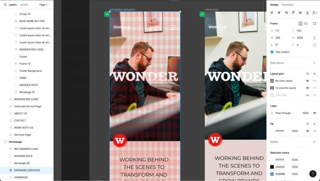
Use Grids: Stick to grids to help developers understand your layout.
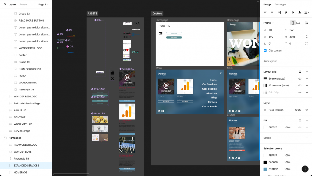
Prepare Assets: Make sure your assets are ready for export in different formats, so developers can easily use them.
Pick Plugins: There are many Figma plugins that can help turn designs into code, which is great for developers.
Design process for SXO
What is SXO?
SXO combines elements of SEO and UX, designing for user experience with SEO and content in mind.
If you want to know more about Search Experience optimisation take a look at our other blog here.
Understanding User and Search Intent
The first step involves understanding your target audience and their search intent. This means gathering insights on who your audience is, what they are looking for, and how they phrase their searches. This knowledge shapes the content strategy, ensuring that it aligns with user needs and search trends, making your website user-friendly and visible in search engines.
Mobile-First and Responsive Design
With mobile searches rising, a mobile-first design approach is crucial. Design your website in Figma for smaller screens first, ensuring that it’s responsive and prioritises content and functionality that mobile users find most valuable. This approach improves the UX for a significant portion of your audience, benefiting your SXO.
Visual Hierarchy and Navigation
Creating a clear visual hierarchy and intuitive navigation in Figma helps users find information quickly and easily, a key aspect of UX. Use size, colour, and layout to guide user’s attention to important elements. Well structured navigation, informed by your understanding of user and search intent, also helps search engines understand your website’s structure, boosting your SXO performance.
SEO Elements in Design
Incorporate SEO elements directly into your Figma design, such as pagination, breadcrumbs, and correctly sizing headings. Planning these elements in the design phase ensures they are not overlooked in development, improving your website’s visibility in search results.
Working Together with Developers
One of the most dynamic features of Figma is its ability to leave live comments directly on the design files. However, getting developers to leave live comments in Figma regularly can be a challenge, especially if they’re not used to such a collaborative approach. To encourage this practice, start by sharing a detailed prototype with them, highlighting the importance of their insights from a technical and user experience perspective.
Begin with a walkthrough session, demonstrating how to leave comments and navigate the prototype. Explain how their technical feedback is crucial in identifying potential issues early in the design phase, which can save time and resources down the line. Emphasise that this process is about finding faults and suggesting improvements and alternatives that could enhance functionality and user experience.
DEV Mode
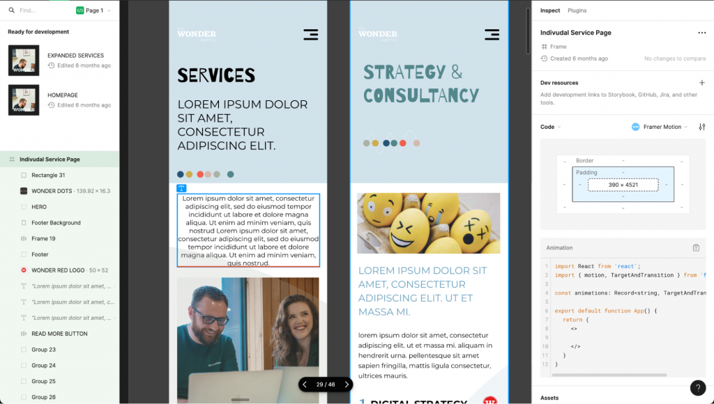
DEV mode in Figma is a specialised feature designed to streamline the handoff between designers and developers by providing an environment where developers can easily access and inspect the technical details of a design. When a file is viewed in DEV mode, developers can see properties such as spacing, dimensions, fonts, and colour values, as well as export assets directly from the design.
This mode eliminates the guesswork for developers trying to translate design into code, allowing them to copy styles, assets, and code snippets accurately and efficiently. By using DEV mode, developers can ensure that the implementation closely matches the designer’s vision, facilitating a smoother transition from design to development and ultimately speeding up the production process. This feature underscores Figma’s commitment to fostering collaboration and efficiency within digital product teams.
Conclusion
Figma is more than just a design tool, it’s a way for designers and developers to work closely and efficiently. By knowing how to use its features, organising your work, considering developers in your design, and collaborating effectively, you can make your design process not just faster but also more enjoyable. So start using Figma to turn your creative ideas into reality, together with your development team!
If you’re seeking digital solutions that blend innovative design with web development, we’d love to hear from you! Drop us a message and our friendly team will get back to you.


