

Benefits of Mobile-First Design
Date: 13 April 2023
What Is Mobile-First Design?
Mobile-first design is a paradigm for creating websites where, as the name suggests, the design of the mobile version is prioritised and implemented first, with tablet and desktop features and functionality following afterwards.
The logic behind this is that mobile design is considered the most challenging to design for effectively. This is due to the minimal amount of screen space available on mobile devices, meaning that only the most important features can be included. This is almost like a base UX, in the sense it includes only the essentials.
Why Should I Use Mobile First Design?
Improved User Experience
As we mentioned previously, utilising a mobile-first approach leaves your sites with only the critical UX elements of the application, helping to create an uncluttered and easy-to-navigate experience for your users. You can use this opportunity to streamline your user journey to be tailored for the device being used, e.g. making a checkout experience as simple as possible for anyone using your website.

SEO
With the large and continual rise in internet traffic coming from mobile devices over the years, search engines such as Google have started prioritising mobile-friendly websites in their search results. Even if most of your users are coming from desktop, you may not be ranking as well as you could be if you’ve neglected the mobile version of your website.

Faster Loading Times
Using minimalistic design elements that are optimised for small screens leads to faster loading times, this can be critical for mobile users who are on the go and need quick access to information. We’ve already talked about SEO - keeping your website quick and snappy is another way to get your name in Google’s good books.
Best Practices
Correctly Size Your Media
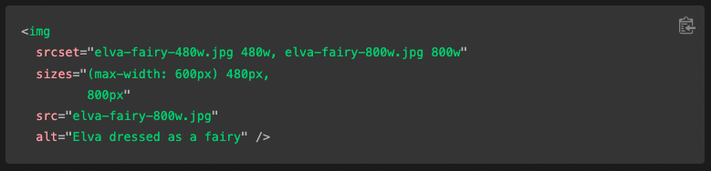
Images and video can have a negative impact on your page speed if they haven’t been optimised appropriately. You need to make sure you’re not loading large assets unnecessarily. You could use media queries to add logic for what element is shown at what screen size, or you could use features like srcset and the <picture> element.
Choose the Best Page Content
What content is most important? Which parts of content are crucial to delivering the message your business wants to deliver, or pushing your users the direction you want them to go? These are vital questions to answer before moving on to implementation. Once you have your answers, prioritise this content to be prominent within the visual hierarchy of your page.
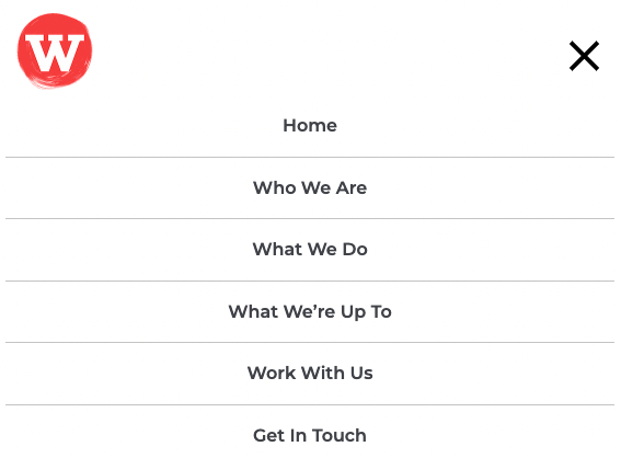
Implement Effective Navigation
Creating an elegant, easy-to-use mobile navigation for your website is essential. This is even more so if you have a lot of menu/submenu items. If you want users to explore your site, you must make it as easy as possible for them. This could include using dropdowns, navigation drawers, full-screen menus or your own idea for a mobile menu.
Use the Right Measuring Tools
There are a number of useful and cost-free tools available to you when it comes to getting feedback on the quality of your mobile design. A really useful one is Google Lighthouse, which looks at various aspects of a webpage and analyses the things you’re doing right, and things you could improve on. You can explicitly set it to look at your mobile or desktop version to understand how you can tailor your design to each one better. But don’t just take our word for it - give it a try! There are also plenty of alternative tools you could explore and experiment with.

Summing Up
Hopefully we’ve been able to walk you through the benefits of utilising mobile-first design and why you shouldn’t ignore it. If you have any questions, or are looking at starting a digital project, get in touch with us here at hello@wonderagency.co.uk and we’d be pleased to help.

Let us help you with that idea
Wonder what we can do for you? Send us a message and we’ll let you know!
Let's Talk