
Since the increase in popularity of smartphones in the late 2000s, along with their constantly improving feature set, capabilities and advancements in internet and connectivity, we have seen a shift in how users access websites. Gone are the days of waiting to get home and boot up a PC or laptop. Instead you pull your phone out of your pocket or bag and instantly get access to the information you need.
While it wasn’t the first smartphone, since Apple released their first iPhone in 2007, thousands of other devices have been released with similar features and capabilities. Over time, these devices have started accounting for more and more of internet traffic.
At the end of 2016, mobile web traffic overtook desktop traffic for the first time. And according to Statista, in 2023, mobile ecommerce made up over 60% of all ecommerce sales around the world.
Table of Contents
A Brief History of Websites on Mobile Devices
The Internet has existed on mobile devices since the mid-90s, but not as the useful tool we know today.
Early Mobile Websites
The Nokia Communicator was one of the first mobile devices which could access the Internet, using its built in modem which connected to 2G networks. By the end of the nineties, the Wireless Application Protocol (WAP) was invented to allow more devices to browse simple, text-based websites.

Screenshot of the BBC Glastonbury WAP website
There weren’t many ecommerce websites during this time, but Amazon, eBay and Ticketmaster are some examples of websites which still exist today. The lack of images and slow speeds meant that users didn’t often use their mobile devices to make purchases online.
Mobile Optimised Websites
Once mobile devices with colour screens became more popular and improvements were made to connectivity, developers started creating mobile optimised websites. These were usually simplified websites and companies started hosting them on separate domains, usually starting with “m.”.
Amazon, eBay and Ticketmaster all had mobile optimised websites, which offered simpler functionality than their desktop counterparts, but with better connectivity on mobile devices and more widespread use of images, confidence in using mobile devices for making purchases started to increase.

Screenshot of m.ticketmaster.com from July 2010
Responsive Website Design
As previously mentioned, the launch of the iPhone in 2007 kickstarted the trend of mobile devices with larger screens, with touch capabilities making browsing the internet significantly easier.
In 2010, Ethan Marcotte introduced responsive web design (RWD) which allowed developers to have a single website which responded to the size of devices. This meant developers only had to develop and maintain one website, rather than two different ones.

Migrating from m-dot websites to a responsive website
Often desktop was the primary design, as this was the device most visitors still used. Mobile was sometimes an afterthrough, with the removal of features to create a more simplistic website that focused on its key features.
Mobile-First Website Design
For over ten years, mobile-first design has been the standard, where websites are designed for mobile devices first and then expanded for larger screens. This helped improve speed, experience and accessibility on mobile devices as they were the focus of design. Further improvements to connectivity only cemented the usage of mobile devices and the world we live in today.
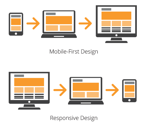
Comparison of the mobile-first design approach to the responsive design approach
Mobile-first design was also influenced by Google, as in 2015 they introduced mobile-friendliness as a key factor for search ranking on mobile devices, which further reinforced the importance of mobile-first design. Then in 2021 they completed the switch to mobile-first indexing which prioritised mobile versions of websites when crawling and indexing websites.
Why Is A Mobile-First Design Approach Important
Following a mobile-first design approach is important, even if your Shopify store customers are mainly using desktop devices. Google’s mobile-first indexing crawls the mobile version of your store, which means that if you don’t have an optimised mobile store, you might be hurting your search engine rankings on desktop too.
Using a mobile-first design approach means you can focus the content and features of your store from the start, rather than trying to choose how to scale back a complex desktop design. This way you should create a store which is fast, easy to navigate, includes the most important information first and makes products easy to purchase.
Ultimately, a mobile-first mindset leads to a more responsive and adaptive design. Starting with mobile ensures that your site will scale gracefully across all devices, from phones to tablets to desktops.

Why Is Mobile Optimisation Important For Your Shopify Store
Historically, your Shopify store might have seen more traffic and conversions from desktop users than mobile users. This isn’t unusual, depending on your target audience and how your store has been optimised.
If your store was primarily aimed at an older demographic, many of these customers may have been slower to adopt mobile shopping habits. Some shoppers have traditionally felt more comfortable making larger purchases on a laptop or desktop, while mobile was reserved for smaller, impulse buys. However, as digital-native generations grow up with smartphones, we’re seeing a shift and higher-value purchases on mobile are becoming increasingly common.
In the past, your Shopify theme may have been designed with desktop browsing in mind. While Shopify themes are generally mobile-responsive, not all are equally optimised for mobile performance. If the mobile user experience felt clunky or slow, shoppers might have opted to complete their purchase on desktop instead. Now, users are more likely to abandon the experience altogether if it’s not mobile-friendly, rather than switching devices.
Your Shopify analytics might show a higher percentage of desktop traffic, but the real question is: why? Are users bouncing from your site on mobile due to poor loading times on mobile networks? Are they struggling to find the information they need or to complete the checkout process on a smaller screen? This could be leading to underreported mobile engagement and missed opportunities for conversion.
Shopify offers a variety of tools and themes designed specifically to optimise the mobile experience. Whether it’s speeding up load times with fast, lightweight themes, or using Shopify’s native mobile-friendly checkout, there are plenty of ways to improve the customer journey on smartphones.
If you are getting less purchases on mobile, is the experience optimised for mobile? Is the key information and purchase functionality easy to find, near the top of the page? If it isn’t, then this could be one of the reasons why users aren’t making purchases on your website.
If you’re seeing fewer purchases on mobile, take a moment to evaluate the experience from a user’s perspective. Visit your own store using your mobile device, preferably on mobile data instead of WiFi. Does it load quickly? Is it easy to navigate? Can you find key product details and add items to the cart without friction?
Just because your audience used to shop more on desktop doesn’t mean that has to be the case going forward. With a mobile-optimised Shopify experience, you could unlock a whole new segment of your audience and improve conversion rates across the board.
How To Optimise Your Shopify Store For Mobile
There isn’t a one size fits all approach to optimising your Shopify store for mobile. It has to be right for both your users and your brand. Making optimisations which negatively affect your brand can be as bad as having a slow website!
At Wonder, we build all our Shopify websites with a mobile-first approach, using bespoke, responsive designs that adapt to the user’s device. With that in mind, here are some of our key considerations for optimising your Shopify store for mobile.
1. Minimise Pop-Ups and Intrusive Elements
Pop-ups can be really useful to show information directly to users. They are often used for collecting email addresses in mailing lists by offering discount codes, or used to promote offers and sales.
However, they can cause a negative impact on user experience if they appear at the wrong times, in a way which impacts how the user navigates around the store, or too many pop-ups appear. This might cause the user to leave the store and can lead to high bounce rates, which can have a negative impact on search engine rankings.
If you want to use pop-ups, follow some of these tips to make sure they are optimised for mobile:
- Trigger them on scroll or exit intent, and not instantly appear when landing on the store.
- Try not to use full screen pop-ups and use smaller banners towards the bottom of the screen.
- Make sure pop-ups are easy to close with a clear close button.
2. Simplify and Prioritise Mobile Navigation
A well-structured and easy-to-use navigation is important for keeping users engaged and guiding them to the right products without difficulty. Customers may leave and find an alternative store if they find navigating your website too complicated or frustrating.
Improving your navigation is an ongoing process. It’s important to regularly review how users navigate your store to continue improving their journey.
Mobile navigation can also be improved physically too. Here are some of our tips on how to make improvements to your mobile navigation:
- Implement a fixed navigation bar. This way important information is always accessible without having to scroll back to the top of the website.
- Use a simple hamburger menu with a limited number of key options.
- Organise collections and use filters to help users refine the products they are shown.
- Implement and optimise search functionality and results to make finding products easier. Using predictive search can help users to find products faster without having to visit collections first.
3. Speed Up Load Times
Mobile users potentially are accessing your store on less reliable networks, so having a fast website is important. Google also rewards websites which are faster, so this will also improve your search engine rankings and potentially make your store more visible to potential customers.
There are a number of improvements that can be made to speed up your Shopify store. Here are a few of things that we make sure to implement on all websites:
- Compress images – Shopify compresses images when they are uploaded and also converts them to modern web formats such as webp (if your user’s browser supports them) to reduce the file size of images on your store. However, we also recommend using a tool such as TinyPNG and resizing the image to the correct dimensions before uploading to Shopify for further file size savings.
- Implement lazy loading – by implementing lazy loading in your theme, images will only be downloaded when they are required, which reduces the initial time it takes to load the store.
- Code minification – remove any unnecessary characters and white space from CSS, JavaScript and HTML files. This reduces the overall file size of the store, meaning it will take less time to download the files to your device.
- Limit app usage – Shopify apps often inject additional JavaScript and CSS onto your store which can have an impact on how fast your store loads. Individual apps shouldn’t have a large impact on your store, but including lots of apps can have a negative impact. Go through your apps and remove any which aren’t used, and review whether the ones that are in use are still important for your store. Not only could you improve the speed of your store, but you might also save some money if you are paying for apps you no longer need.
- Reduce redirects – redirect chains require multiple HTTP requests which can make the website seem slower because it has to request multiple pages before it gets to the one that the user requires. This also can have an impact on SEO because search engines have to make multiple requests to find the relevant content.
4. Optimise Product Pages for Mobile Shoppers
Product pages are where your customers will decide whether they want to purchase your product or not. It must be easy to find the information they require and add the items to their cart to complete their journey.
Here are some best practices we recommend implementing on your product pages:
- Highlight key information near the top of the page. Include the title, price and availability without having to scroll.
- Use high-quality images to showcase your products.
- Keep product descriptions concise. Including too much information might put potential customers off so include this information in sections which can be displayed if the user wants to find out more.
- Use large buttons to add to cart and buy now. These should be close to the top of the screen and easy to tap.
- Include product reviews. Potential customers want to find out what other people think about your product. If you have good reviews, shout about it!
- Minimise distractions by removing excessive promotions or features from product pages.

5. Implement Mobile-First Design Principles
Google probably crawls your website using its mobile-first indexing, so whether your audience is mainly on desktop or mobile, your search engine rankings are influenced by how well Google crawls your website on mobile. Design your website with mobile as the primary focus, as this will ensure that the most important elements of your website are prioritised and accessible.
- Use vertical layouts which feel more natural on mobile.
- Stack elements to fit narrow screens better.
- Keep elements spaced out to make sure tap targets don’t overlay.
- Use a minimum of 16px for body text and use high-contrast colours.
6. Enable One-Page Checkout
Shopify recently introduced its one-page checkout which doesn’t reduce the amount of information it collects, but creates a smoother journey for your customers to complete their purchase.
To optimise the checkout experience for mobile, try some of the following:
- Enable quick payment options. Shop Pay, Apple Pay and Google Pay are faster and more secure.
- Allow guest checkout to not add additional steps to the checkout process.
- Minimise required fields by only asking for essential information.
If you are using a free or paid pre-built theme from the Shopify Theme Store, consider how well it works for mobile users before making your choice. At Wonder, we build all our Shopify websites with a mobile-first approach, using responsive, bespoke designs that adapt to the user’s device, which include optimised images and clear navigation.
To learn more about our expertise in building high-performing, custom Shopify themes, take a look at our case studies. We’ve successfully partnered with clients like Phoenox Textiles for a Shopify Plus B2B migration, and Ministry of Colours for a complete Shopify rebrand.